Many people believe that all an author does is write their book. Twenty to thirty years ago that would have been true, but nowadays authors must wear many other hats to try to get their books out there and into the hands of readers.
One of the least expected ones (aside from Marketing Guru) is having to become an artist! And I'm not talking being an artist to make covers, I'm talking about art skills for all the extra materials you have to get out there - like logos, bookmarks, business cards, banners and more!
So anyway, I figured I'd share some of the things I've been busting myself on for the last few weeks. You see, I decided my old book marks were too boring. Case in point:

Yeppers, the old book cover, back cover info and urls with fancy name. They've done me good service for many years, but I really felt it was time to spruce things up more! (I'd also ordered a way bigger size than I meant to back then! Oops!)
I lost a little room on what the book's about, but they look so much more handsome, don't you think?

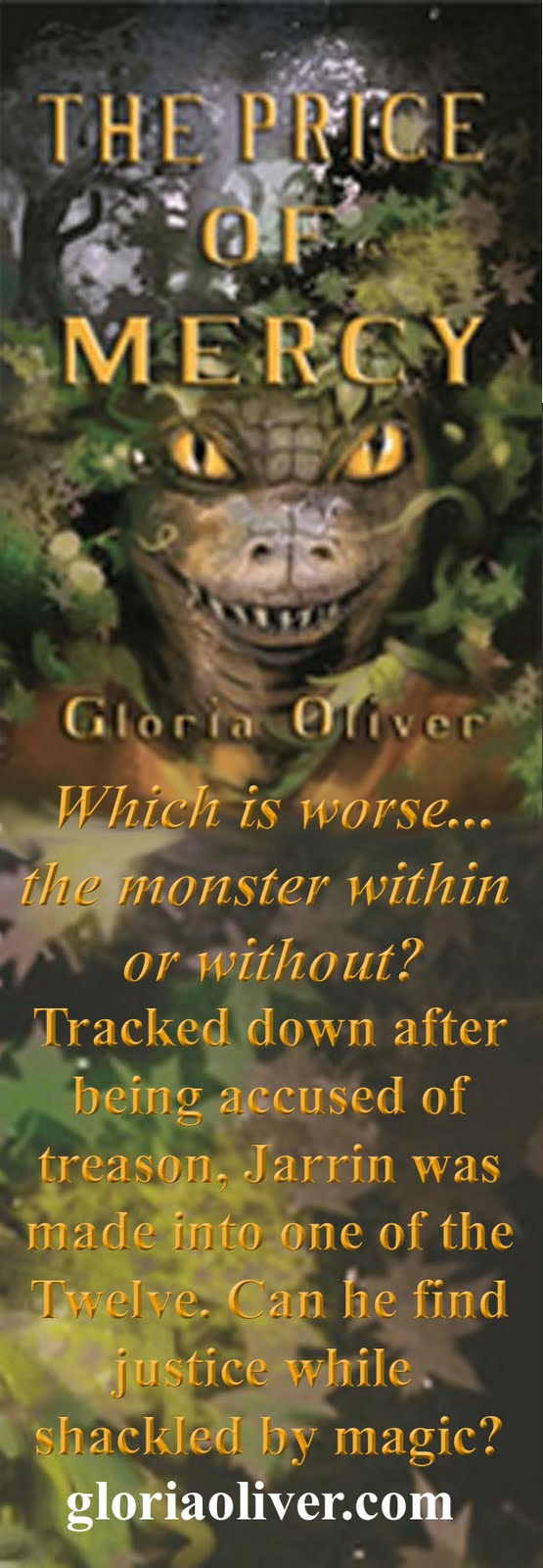


What do you all think? Improvement or not? Do you prefer more book info? Or is the bits tantalizing enough?
I also have business card sized promo with the book cover and tag line on the front, the book back cover on the other side. Had the newest one I really wanted to show off but looks like I forgot to upload it. Will sneak it in if I can, if not, I'm sure I can find another time to foist it on you. Heh heh.


Have a great weekend!
Those look really nice, Gloria. The Price of Mercy is a tiny bit harder to read than most of the others because of the color of the text, but "in person" I bet it is better. Artistically, beautiful. :)
ReplyDeleteThanks! Yeah, they're a bit easier to read in hand. POM gave me fits and was rejected by the printer peeps once. I eventually got a better clue.
ReplyDeleteSadly, by the time I was finding some of the super fancy things I could do in the program, I'd already finished and ordered most of these. :P
Biggest problem was making sure I could squeeze the cover pics for their pretty parts at the right pixels or come up with something that would at least match. This took me forever! lol